The Finale
The aim: To develop an architectural design for placemaking for the urban community.
The outcome focuses on tropical design, services as well as the design of the façade and building envelope that is of coherent language to the overall design scheme within the urban context.
A Community Centre for the Creative City (CCCC) with a focus on Film Photography.
Why AKADEMIE?
The name Akademie pays homage to Leica (Leica Camera AG), who developed the first 24x36mm(35mm) film camera (Ur-Leica) in 1913 and had it patented.
Leica currently runs a program called the Leica Akademie which goal is to increase the fun and enjoyment of photography, as well as to promote creativity in the community.
(35mm Film is the most commonly available film today in 2022 and is widely used by most photographers)
Narrative
When I first visited the site, I found that there were many historical landmarks in the area, however it all felt neglected and ill-lively. Almost everyone walking by were just there for a specific purpose or just passing through to get to somewhere else. This led to my belief that there was a lack of a public realm, where people could stop and appreciate the city.
How to revive the city?
I came to the conclusion that film photography, contrasts greatly with Medan Pasar - the contrast brings interest.
Unlike Medan Pasar, whose history is arguably fading, film photography will never fade. Film tells truthful stories through a tangible, physical mean that will allow people to keep a piece of history, through photographs.
I wanted people to create something new whilst preserving old artforms and values.
To bring an element of modernity into Medan Pasar, while preserving culture and history.
Spaces
Divided into Services, Public, Semi-Private and Private Spaces respectively.
Massing & Design Strategies
Honest Architecture
"The building does not cover up its structure and pretend to be something it is not"
A Brutalist-Industrial Design Approach
The bulk of the building makes of use Steel H-Columns and I-Beams which are proudly on display, as well as the use of raw concrete flooring and walls.
Façade Design
The building makes use of a Perforated Stainless Steel Façade system.
The façade dynamically reacts to different viewing angles.
From an off-angle, it seems almost opaque and solid, however directly head-on, it seems transparent and direct.
This tells a story that depending on the point of view, things may not be truthful and can be deceitful - a reflection of the history of Medan Pasar.
Polygonal Shaping
The polygonal façade also creates an interest on the street level; where different times of the day and different lighting conditions can affect how the building appears. Where light reflects off the stainless steel façade.
Passive Design Strategies
A perforated stainless steel façade can also help reduce over 30% of sunlight heat from penetrating into the building, whilst preserving visibility outward and promoting ventilation and natural sunlight.
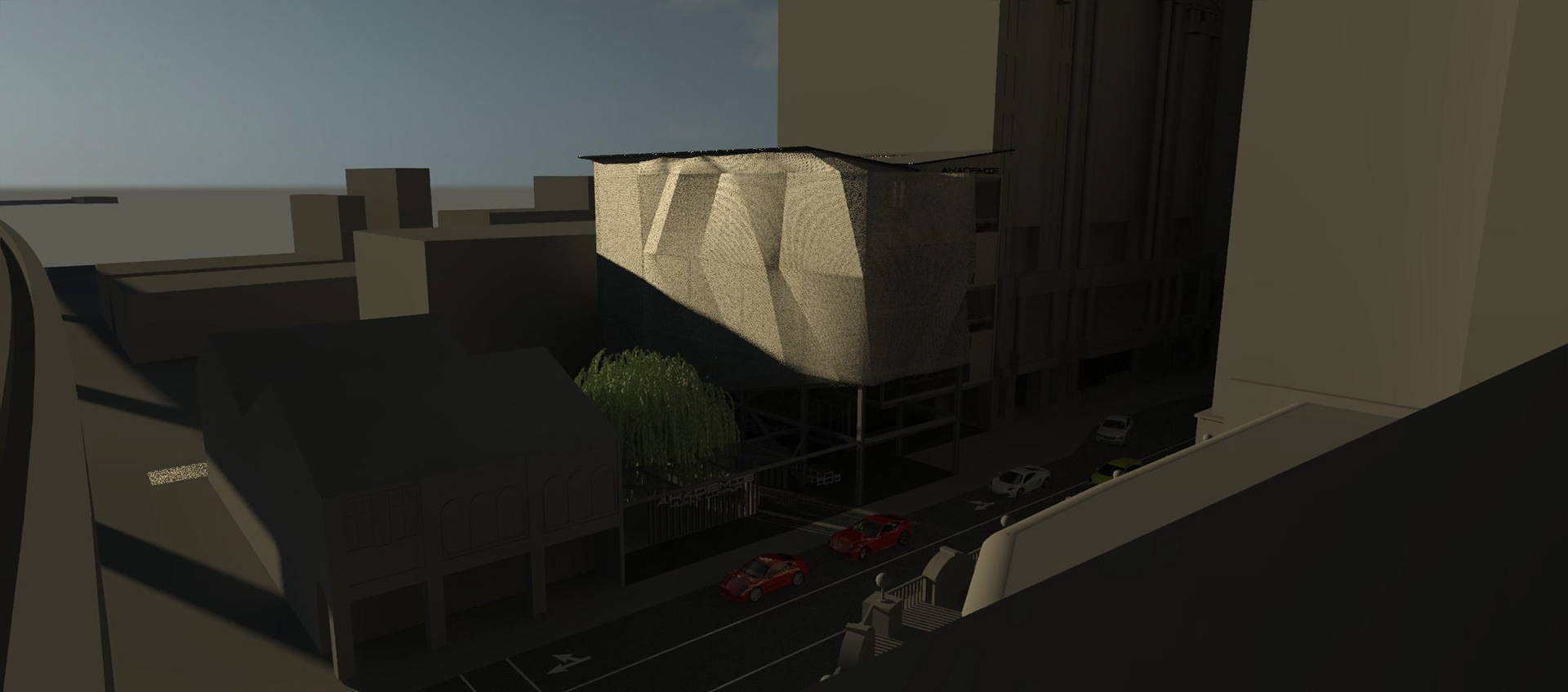
9AM
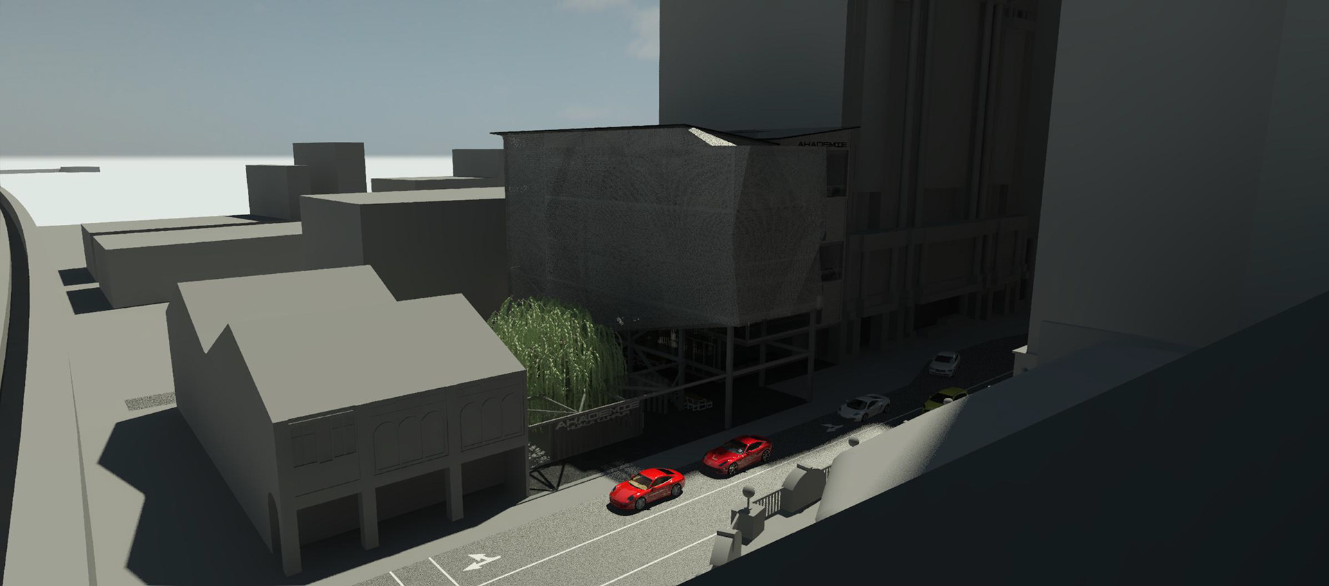
12NOON

3PM
The Experience
Approach
In the public space adjacent the building, there is an existing mural on the shophouses which is kept to be used as a backdrop. It also depicts solidarity among Malaysians. There is also a space for outdoor dining as well as space for people to mingle. This is evident as in Asian culture, the street culture is of utmost importance.
Entrance
Approaching the building itself, they will be greeted with a large double volume atrium, where there will be communal artisan markets, promoting sustainability and creating a stronger sense of community. On the ground floor there are also spaces for café, dining, a lobby and reception; as well as services toward the back-lane.
First
On the first floor is where users can find a library and open-air co-working space. This is a space where working adults or study may come to study or work in their time.
Second
Moving to the second floor, this floor encourages creativity. Users can find a digital lab, printing room and film darkrooms here. There is also a collaborative space for thought sharing and communal collaborations.
Third
The third floor is primarily communal and all about sharing. Where you can find an exhibition space as well as a meeting hall which can be used for various functions or guest talks.
Finale
The fourth floor is private, as evident by the lack of stair access from the atrium. These are spaces where a random passerby wouldn't specifically come for. Users may access this floor via the lifts or fire stairs. Here, people can find workshop spaces, photo studios and a rooftop garden.
Floor Plans
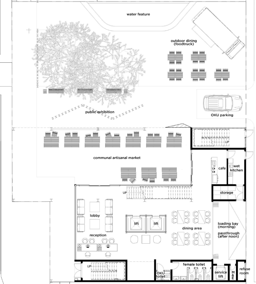
Ground Floor Plan
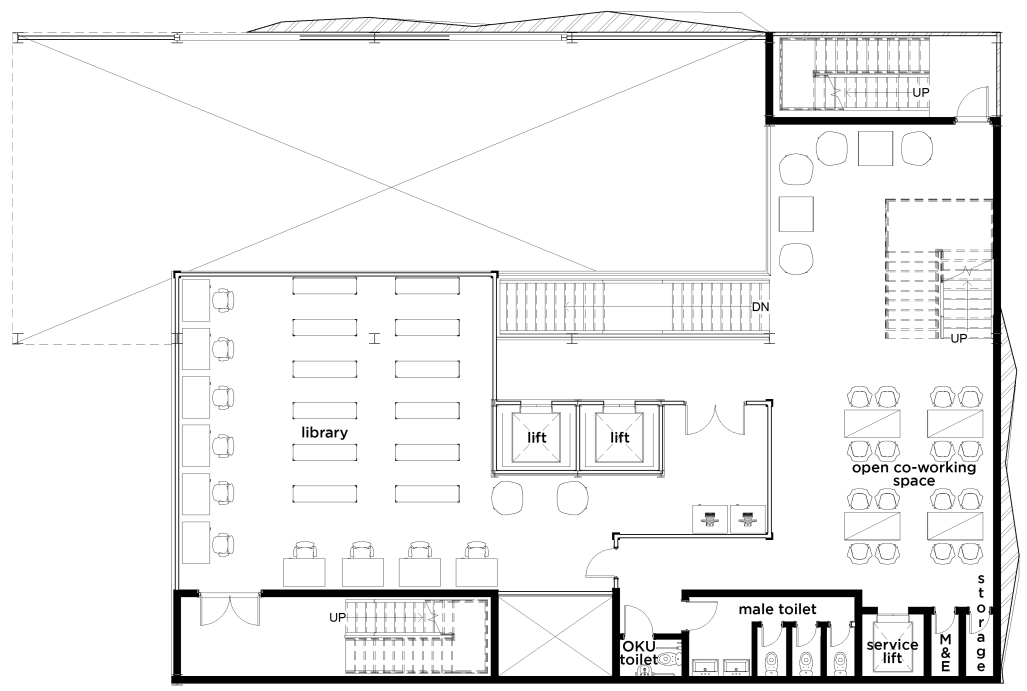
First Floor Plan
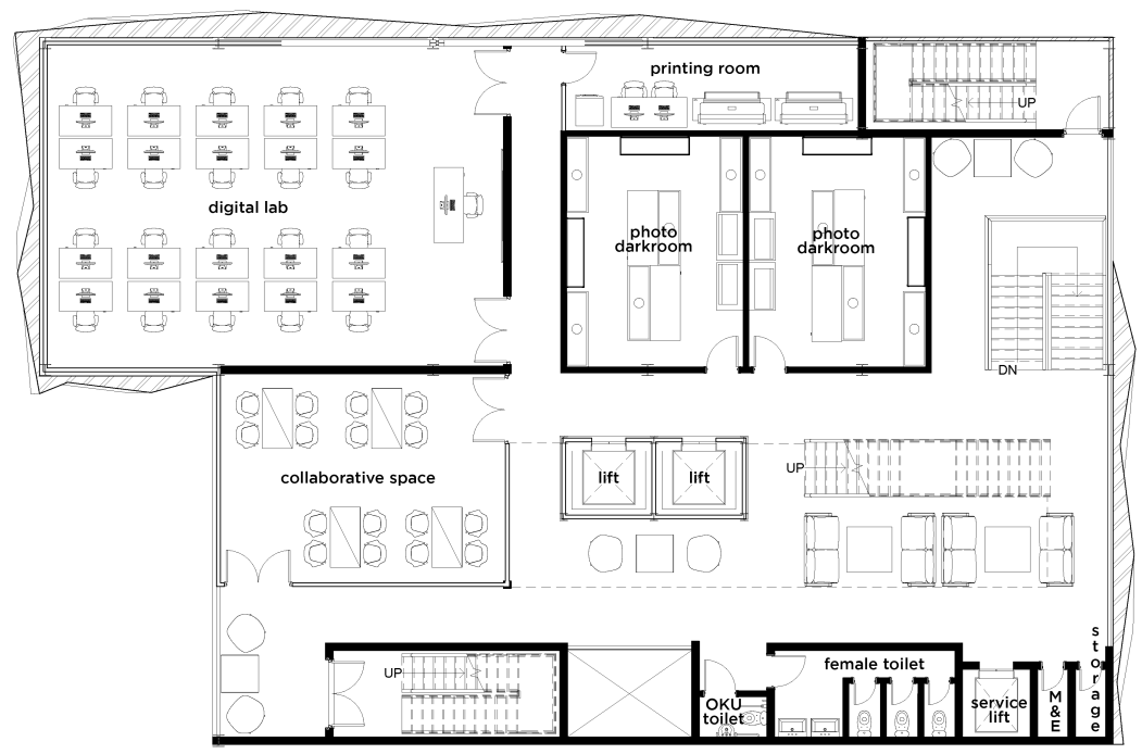
Second Floor Plan
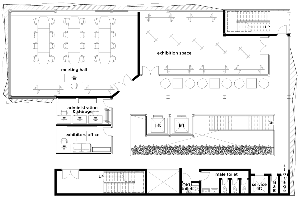
Third Floor Plan
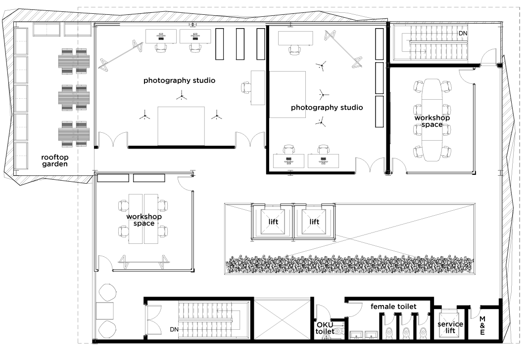
Fourth Floor Plan
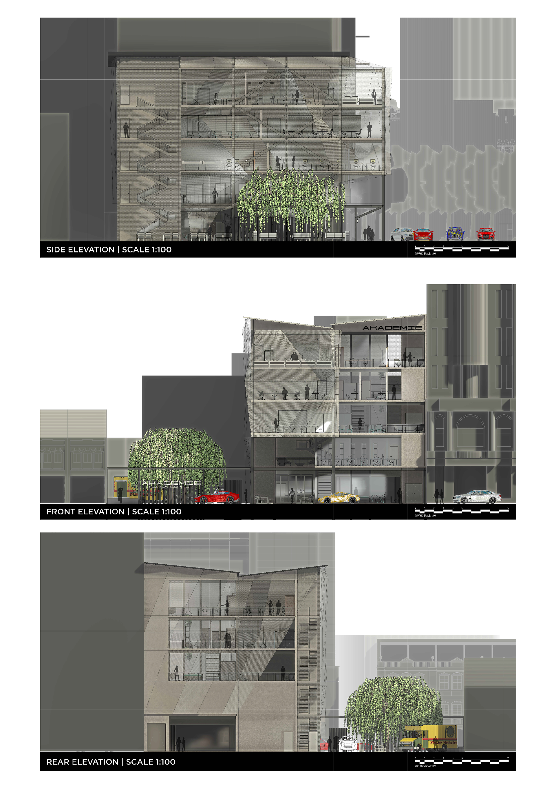
Sections & Elevations
Scaled according to ISO 216 Standard A1 (841 x 594 mm)
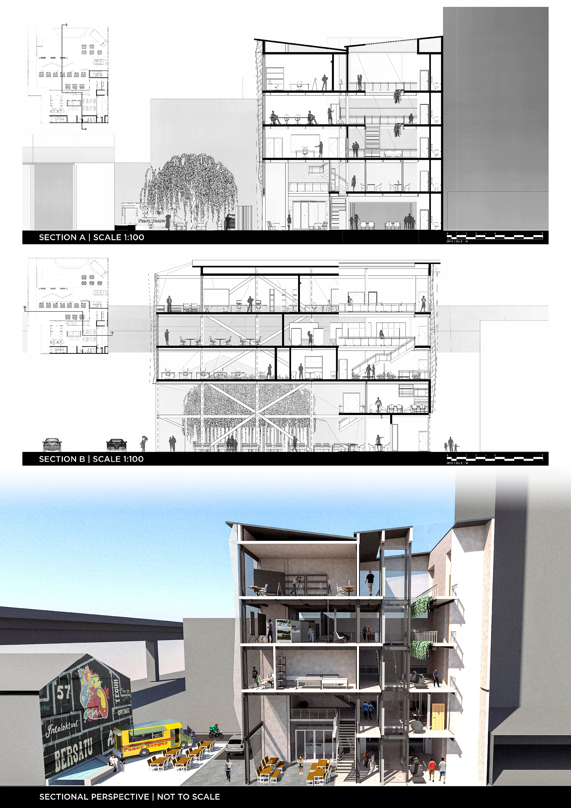
Perspective Renders
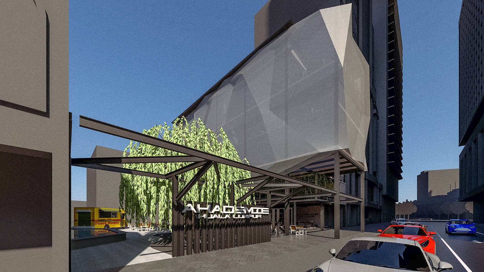
Perspective from Junction
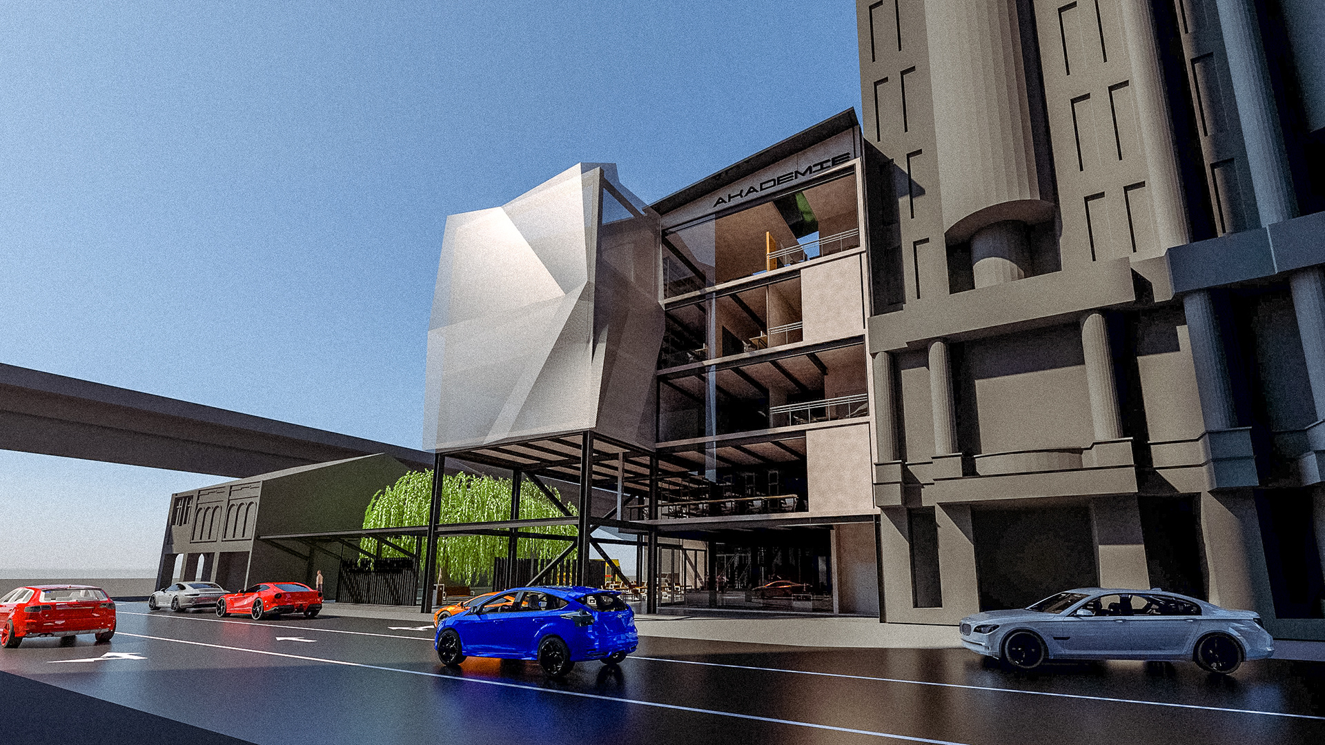
Perspective from Menara CCB
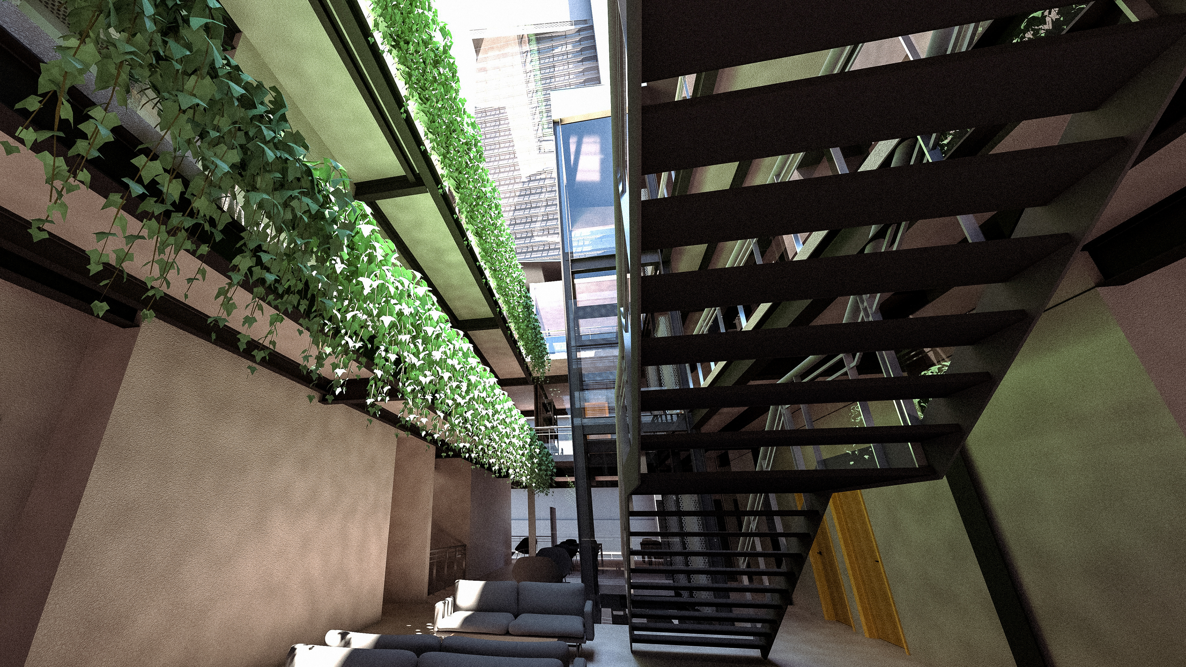
Interior Atrium
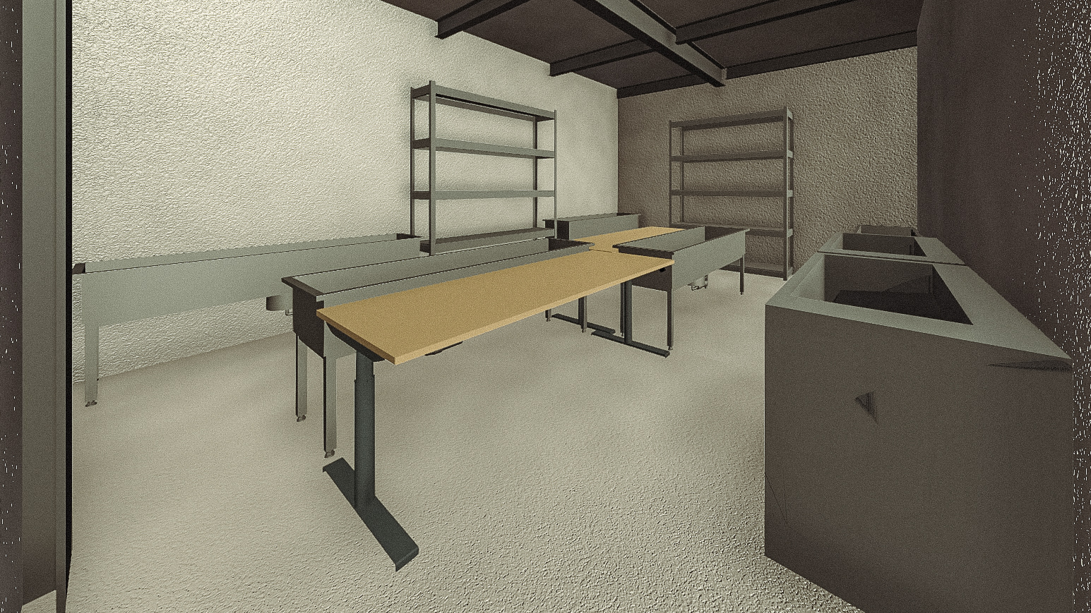
Darkroom for Film Processing
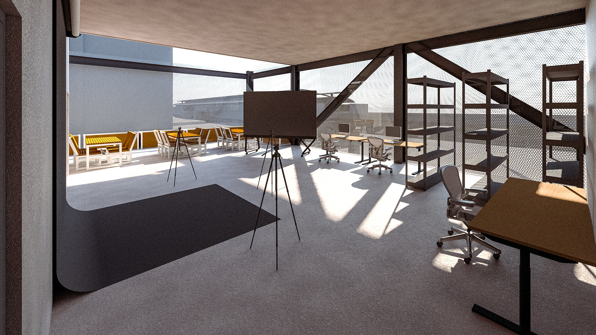
Photo Studio
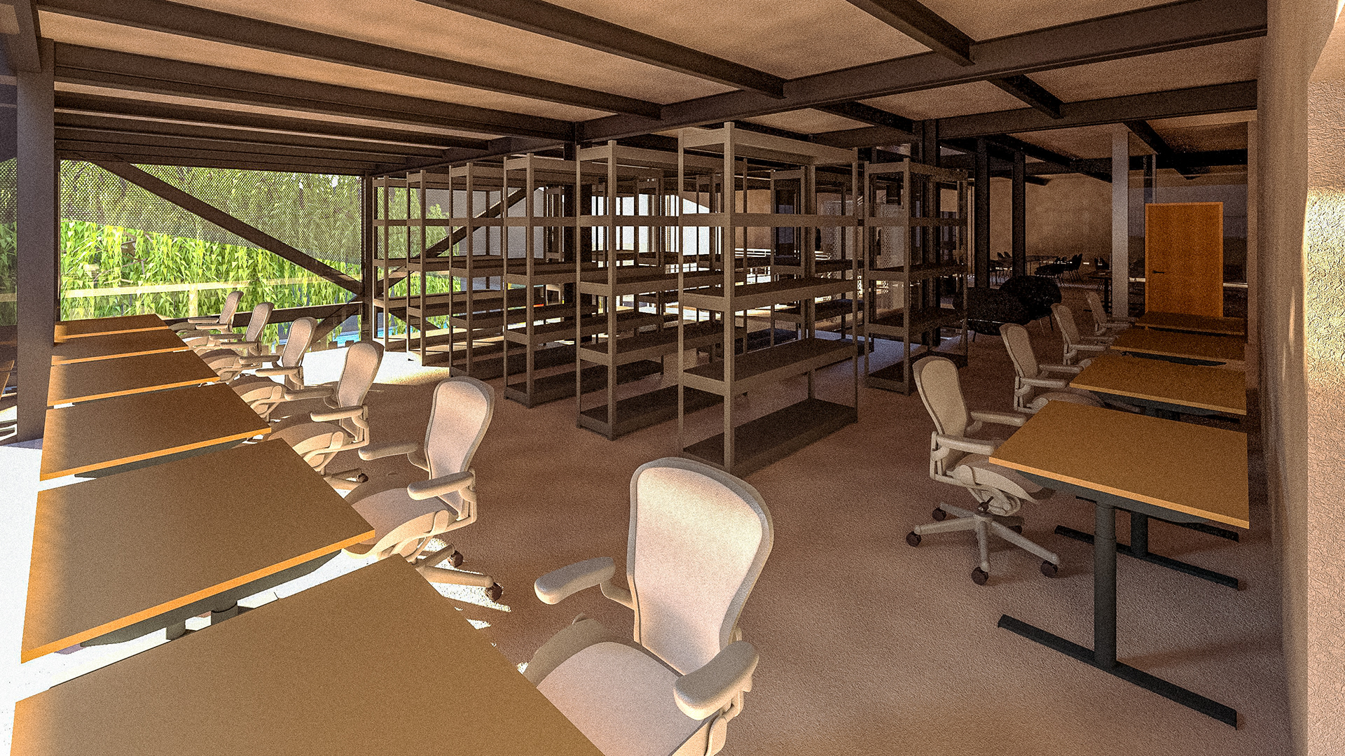
Library
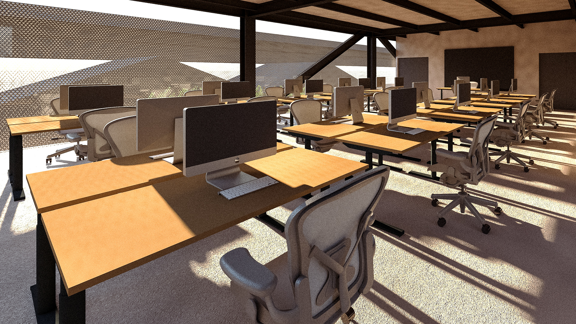
Digital Lab
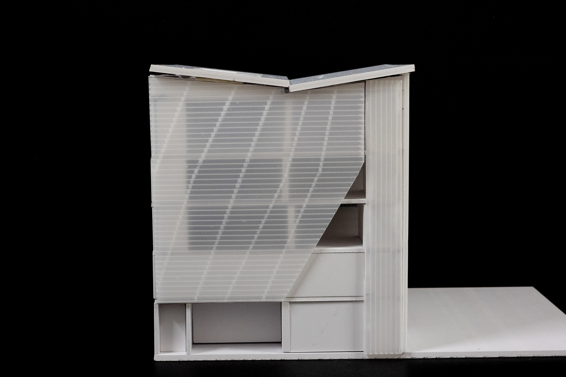
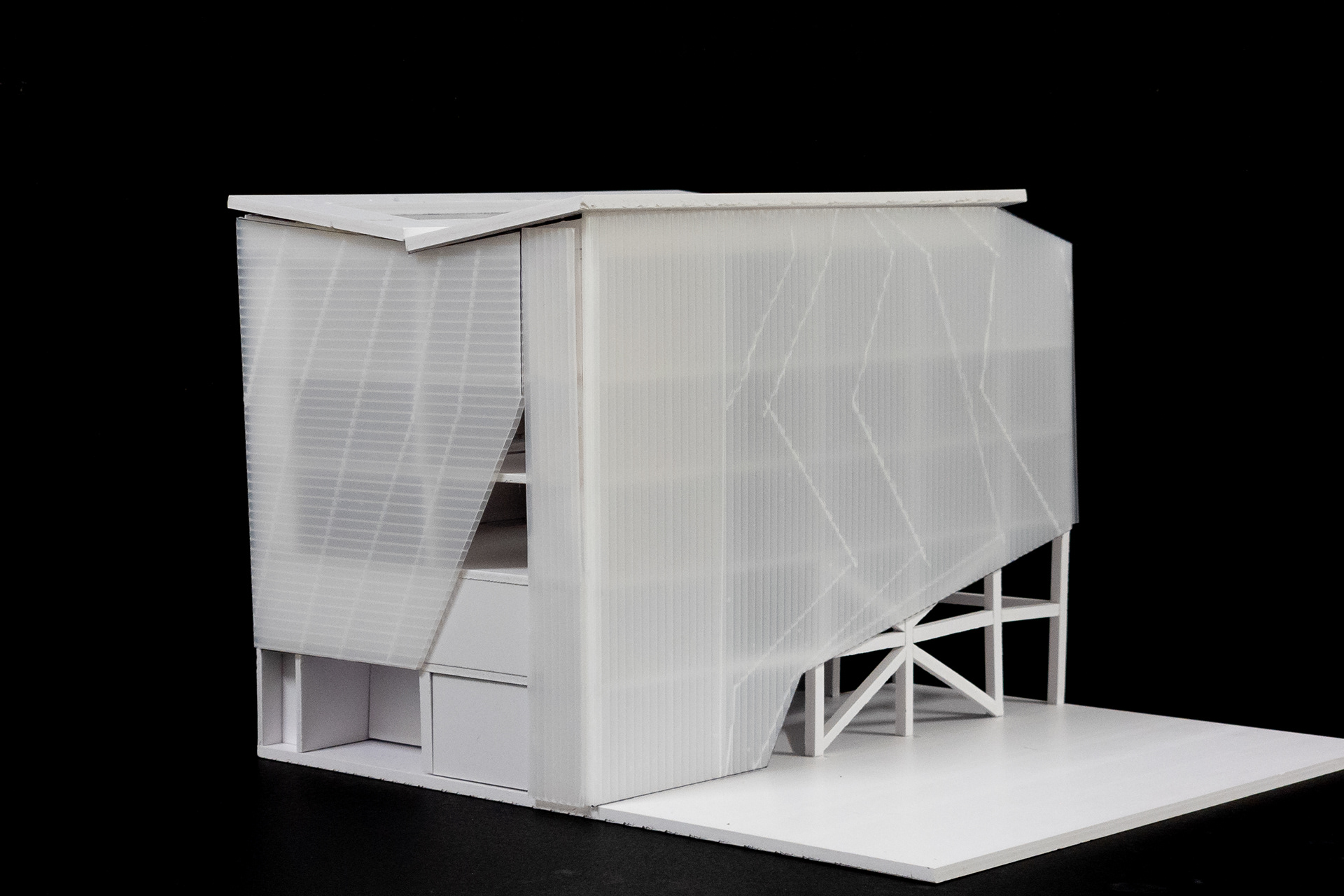
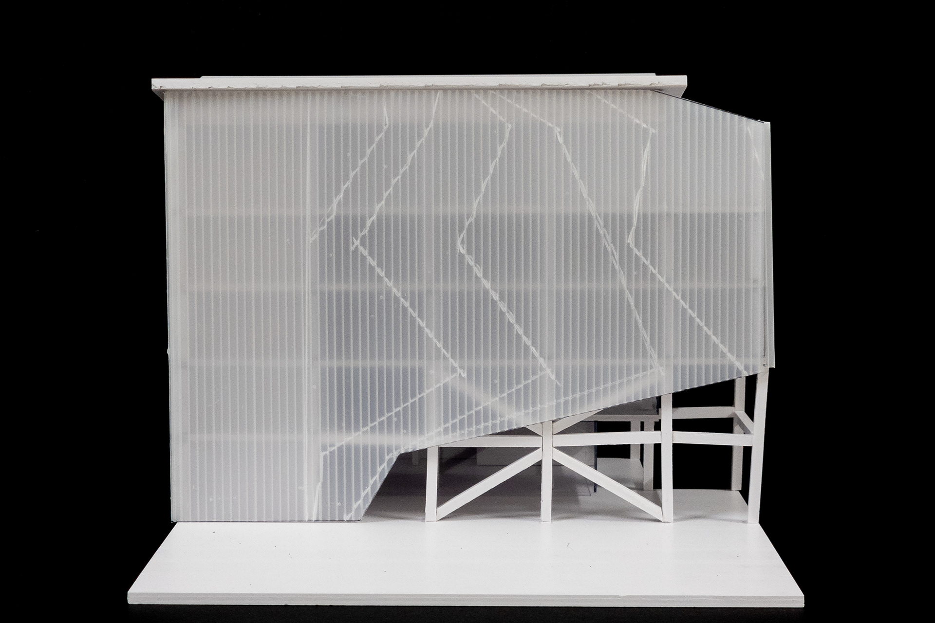
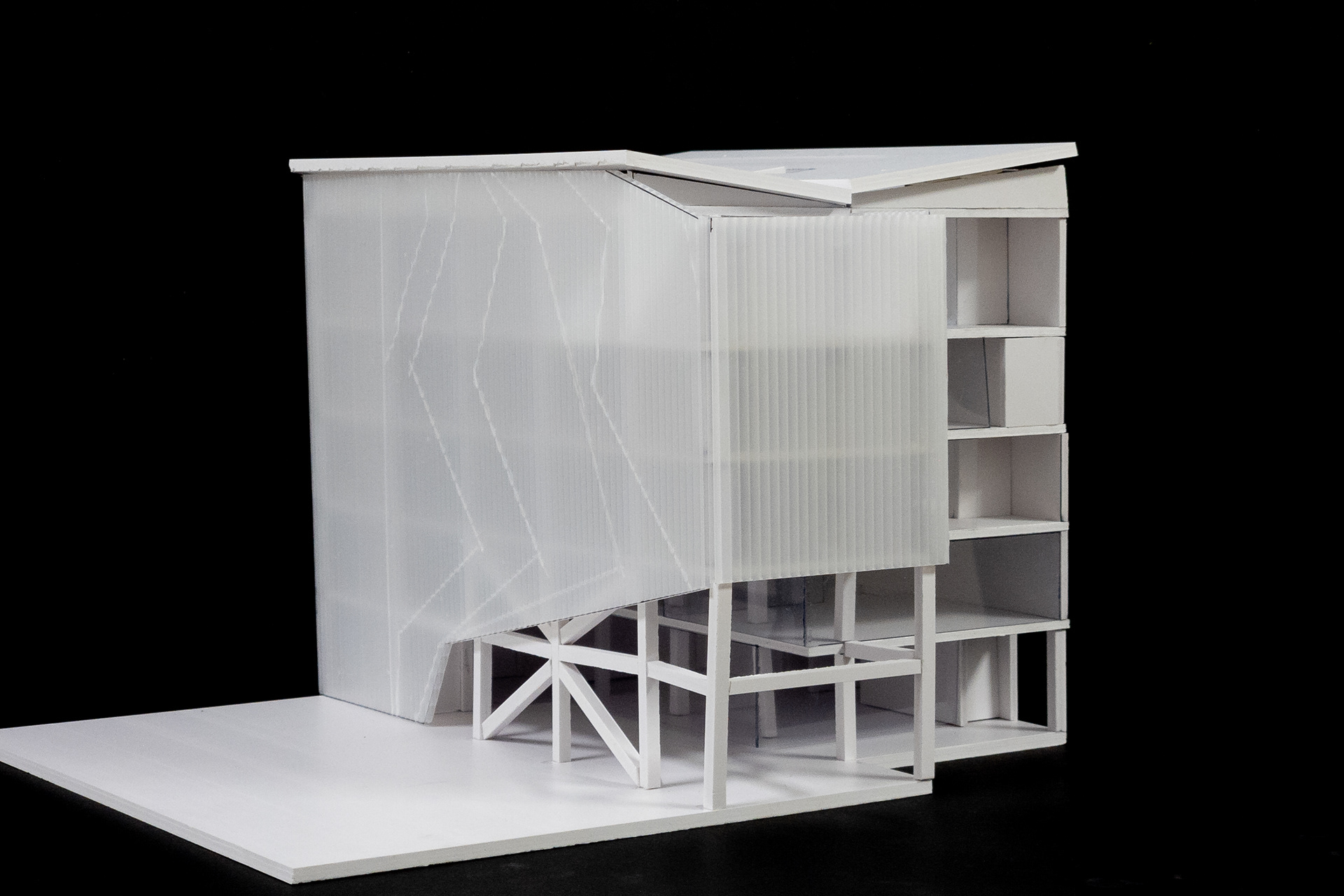
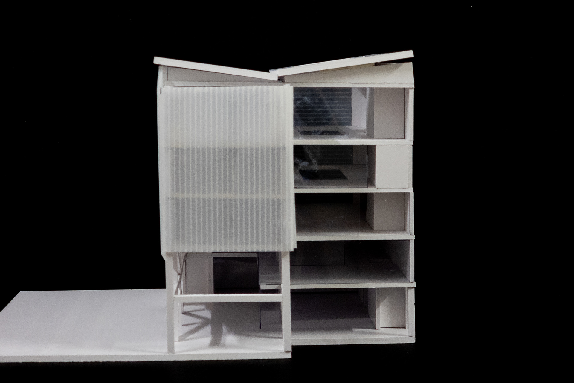
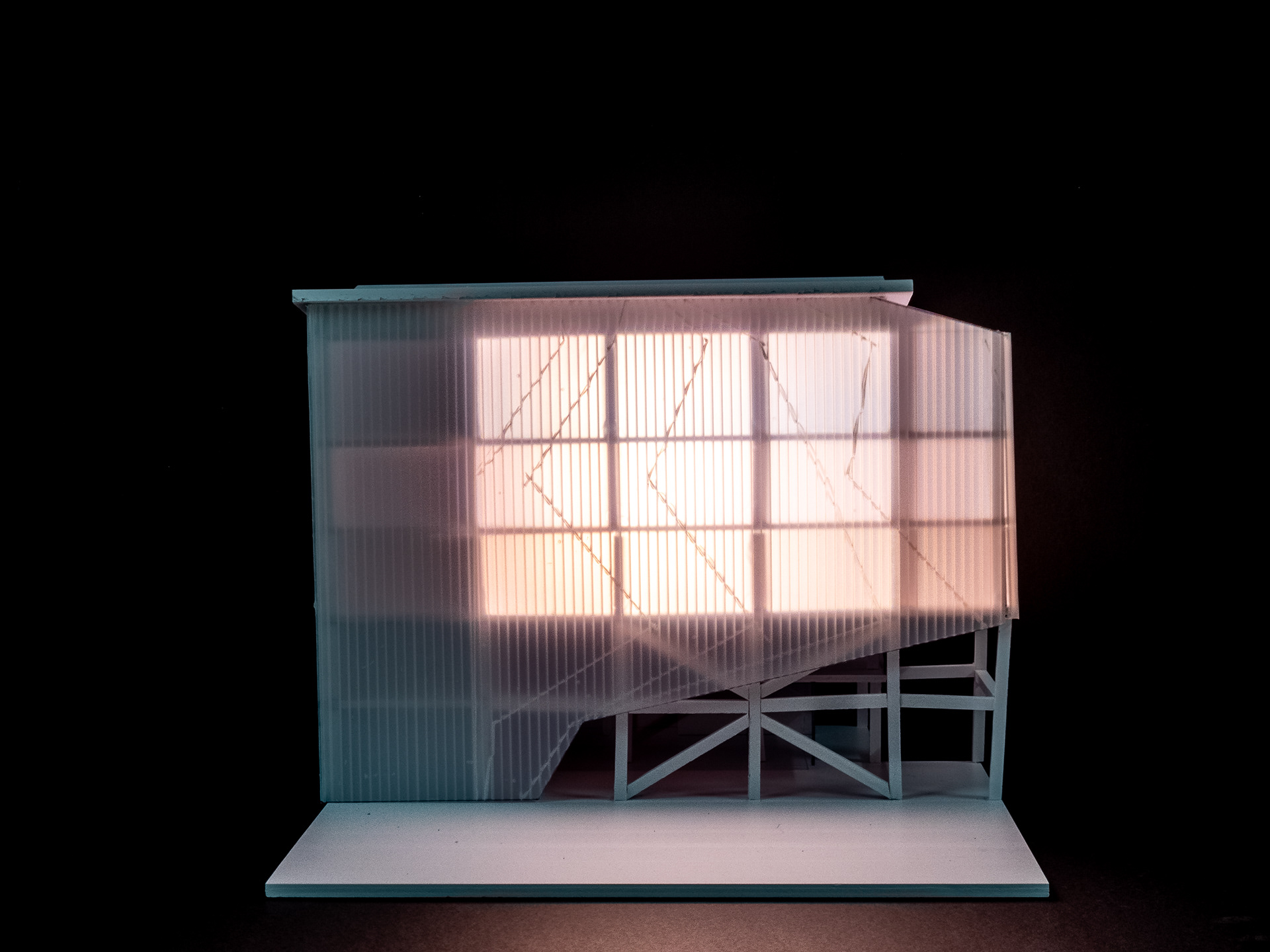
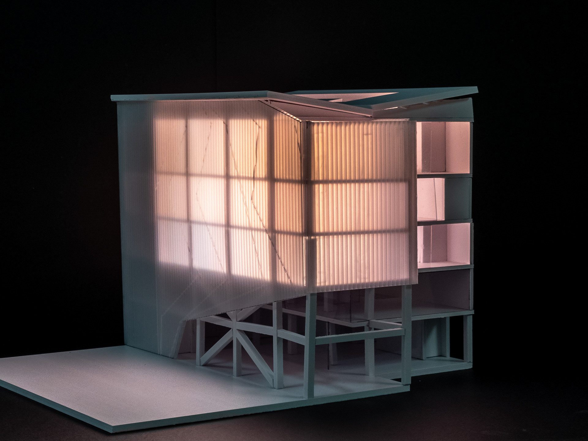
Physical Model in Scale 1:100
Final Submission Boards
Presentation Layout
Final Essay Document
Renders completed in Chaos V-Ray and post-processed in Adobe Lightroom.
Further post-processing done in Adobe Photoshop.
Renders have been processed to simulate film images in relation to the project's programmes.
All product and company names are trademarks™ or registered® trademarks of their respective holders. Use of them does not imply any affiliation with or endorsement by them.


